April 2023: Updates to Signage in the 2010 ADA
Posted on - Monday, April 3rd, 2023Accessible signage can be a very confusing topic. Even after all these years of practicing my accessibility consulting, I am still learning a thing or two. Sadly they can even be confusing to signage manufacturers and installers.
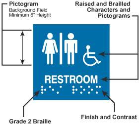
Accessible signs require the following things:
- Raised and Brailled Characters
- Contrasting background
- San Serif Fonts
- Height and location
- If using Pictogram, there are requirements
- If depicting accessible spaces the use of the ISA (International Symbol of Access)
This newsletter will focus on a few common errors I encounter during my inspections mainly about Raised and Braille characters, contrasting background and location
Raised Characters
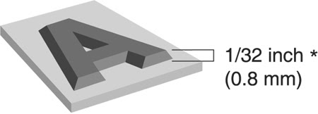
The accessible signage will require that the characters describing the space whether it be a number or letters, must be raised. They should be at least 1/32″ above the surface of the sign.
Contrasting Background
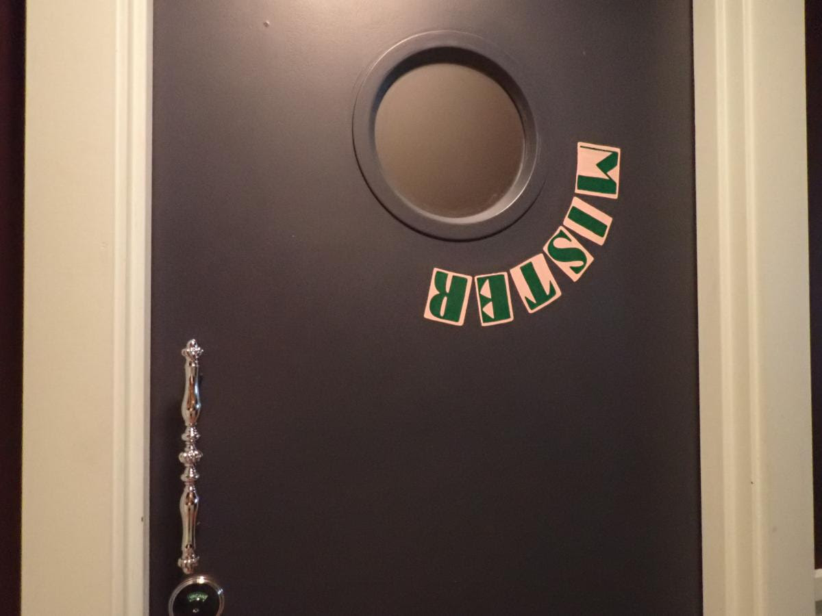
At one of my inspections I encountered some signs that were all white. The raised characters were white as well as the background. The raised characters and the background were too similar in color and therefore there was no adequate contrast.
The requirement for contrasting color is intended for people with low vision. The sign would be too difficult to read without contrast.
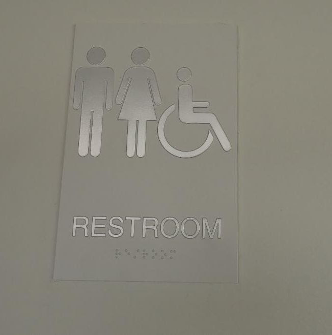
The sign shown above did not have the required contrast between the raised characters and the background
Location
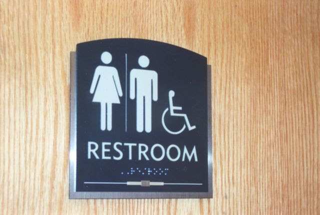
Signage that identify permanent rooms must be located on the latch side of the door or as close as possible on the latch side of the door. It must be located between 48″-60″ to the bottom of the raised characters and there must be a floor space of 18″x18″
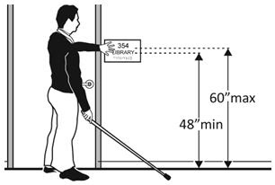
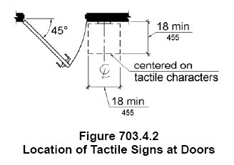
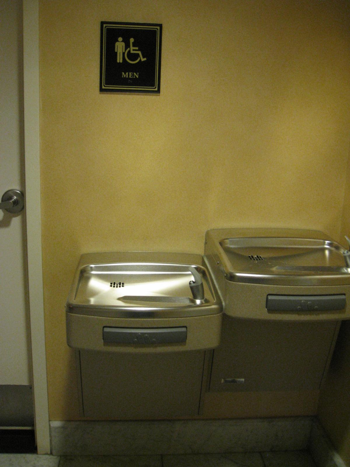
The sign shown above did had a drinking fountain at the floor area and did not have a clear 18″x18″ at the floor in front of the sign
In addition to permanent rooms, signage with Braille and raised characters must also be located at Exit Stair, Exit Passage Way and Door
ADA Section 216.4.1 Exit Doors. Doors at exit passageways, exit discharge, and exit stairways shall be identified by tactile signs complying with 703.1, 703.2, and 703.5.
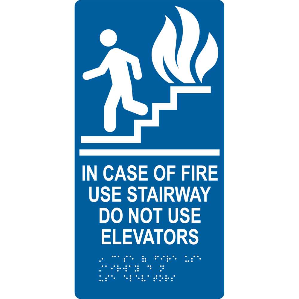
When are accessible signs NOT required?
Not all signs have to meet the accessibility guidelines. Here are the ones that do not required raised characters, brailled etc.
1. Building directories, menus, seat and row designations in assembly areas, occupant names, building addresses, and company names and logos shall not be required to comply with 216.2.
2. In parking facilities, signs shall not be required to comply with 216.2, 216.3, and 216.6 through 216.12.3.
3. Temporary, 7 days or less, signs shall not be required to comply with 216.4. In detention and correctional facilities, signs not located in public use areas shall not be required to comply with 216
 Abadi
Abadi 
