Different types of Accessibility Symbols
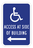
Posted on - Sunday, December 4th, 2011I’ve been noticing lots of different accessibility symbols on signs lately. The one below is the typical accessibility symbol found in the US. But there are variations that make me wonder what the graphic designer was thinking.
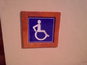
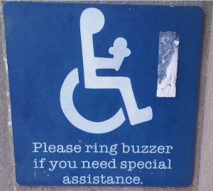
I know for sure what the first one was thinking. I found it at an ice cream shop that was not accessible.
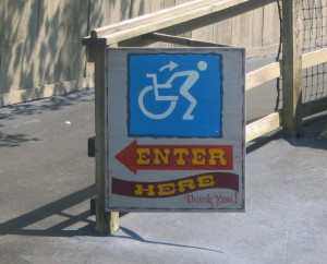
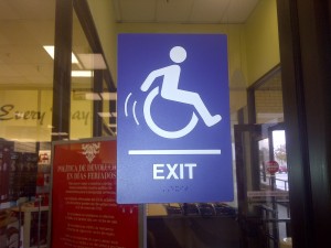
This one I saw at an exit door at a retail store. It looks like they really want you to leave in a hurry! It is the Christmas shopping season! They need all the room they can get!
This one was found in Mexico. I think they must be teaching us total independence.
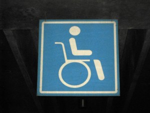
This one I saw in Panama City Panama. The symbol looks pretty comfortable….is it because life is easy in Panama? Ask a Panamanian!
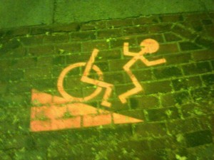
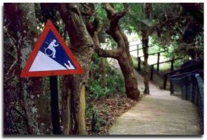
This one is trying to warn the user that if they go in that direction, they could fall due to the steepness of the ramp/walkway
This one looks like it’s for people who are temporarily using wheelchairs and have some mobility.
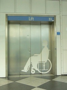
This one is a negative space/silhouette image of a person in a wheelchair. It is very literal
I wouldn’t go there if I were you (wheelchair or not!)
 Abadi
Abadi 

